Neurotic is a London based web development agency for which I occasionally worked on freelancing missions. The team gave me carte blanche to design and develop a new company site that highlights their services and projects. As the production deadline was quite short and they had not yet structured the pages' content, I proposed developing the project as a simple CRUD application in Ruby on Rails, using its latest version.

The front-end part is mainly based on the basic styles that Tailwind offers out of the box, with an extra playful and geeky touch that Neurotic wanted to convey and on which we worked a lot. Neurotic is a full-stack web development agency that delivers all types of projects, ranging from classic web applications to product design or marketing work.

I had to find a visual identity that was sufficiently broad but also techy, modern and easy to undertsand for their audience. I did not prepare not prepare any graphical blueprint for this project, instead I relied on a few key colors and components that defined the overall look and feel of the website. This saved me a lot of time! For the most responsive elements I used AlpineJS and certain component libraries. StimulusJS was also useful for bringing certain elements to life without bloating the page with JS. For the scroll-related animations, I used TAOS, a Tailwind-adapted version of AOS and I am very satisfied with it.
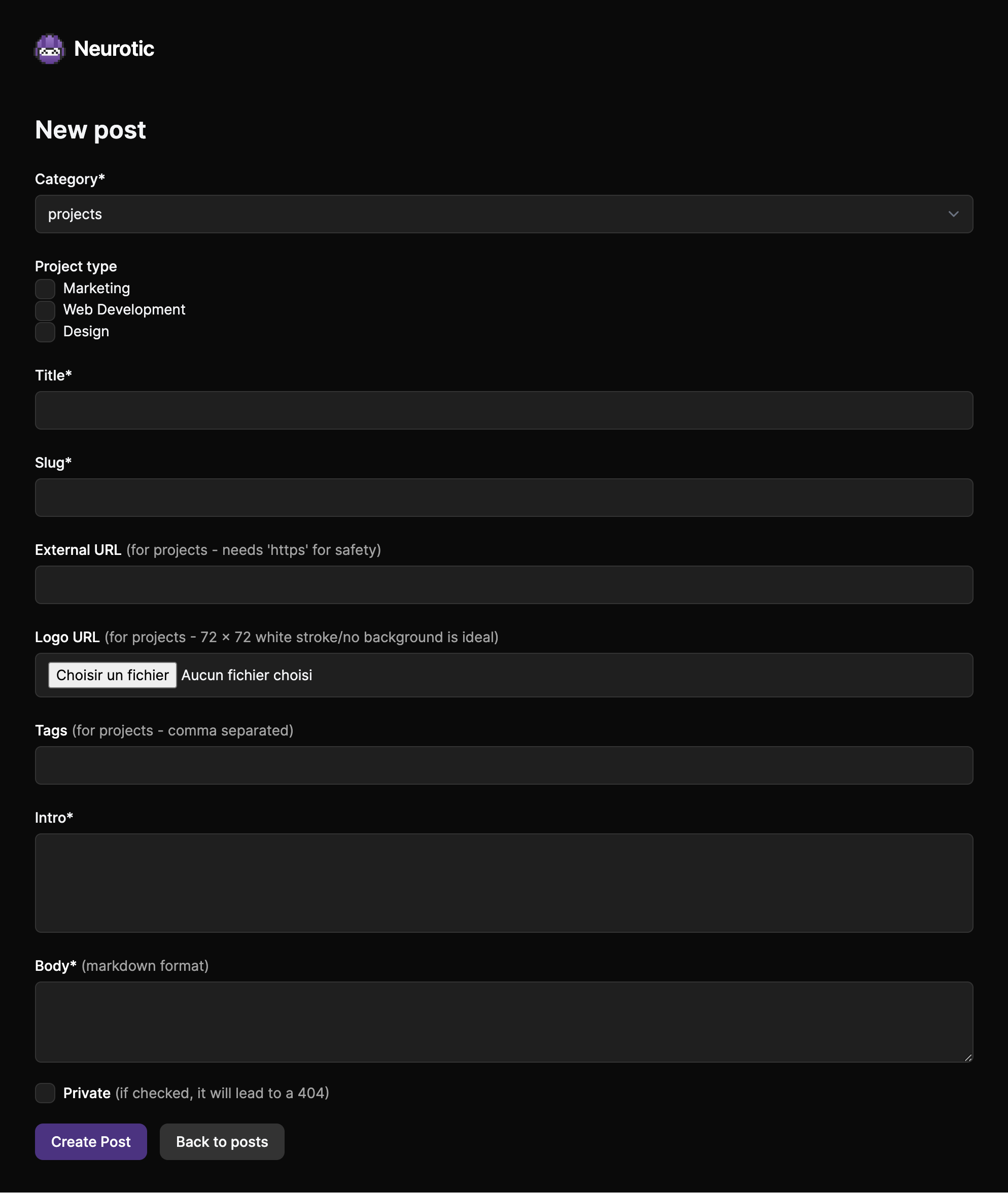
 The backoffice was entirely tailor-made for Neurotic from another project on which I had previously worked. It supports markdown format, multiple post taxonomies, drag and drop sorting, and automatically configures meta tags for each article.

I had a lot of fun designing certain elements that I was able to focus on, like these translucid modals for example, or these custom stickers by superimposing iridescent gradients directly in Figma. I also took charge of writing all the wording for the home page, which engaged the marketing side of my brain, a part of it that had been dormant for quite a while.

The site should further evolve with the implementation of a search engine coded with Turbo to simplify navigation within the projects page, the translation of content into several languages using the i18n gem, as well as the creation of new landing pages based on the same style but in other variations. For measuring traffic without using cookies, we use ActiveAnalytics, but this might change in the future. I am excited about this project's future course. The only downsides for me are the image hosting system, which is based on Backblaze and is not as fast as I would like and finally the choice of logo, which replaces a provisional one that was much better in my opinion: 👾 (the space invader emoji).

All things considered, as a solo developer I remain very satisfied with the Rails + Tailwind combination that have been using for the past couple of years. It's a solid combo that allows you to develop and iterate very quickly with excellent results without wasting too much time on implementation and front-end design. It also makes creating responsive screens a breeze. Neurotic seems to be happy too since lead generation has increased significantly since the page was launched. It also reminded me how much I enjoy combining coding, designing and marketing skills and that projects that are built from scratch are the best to express them altogether.

